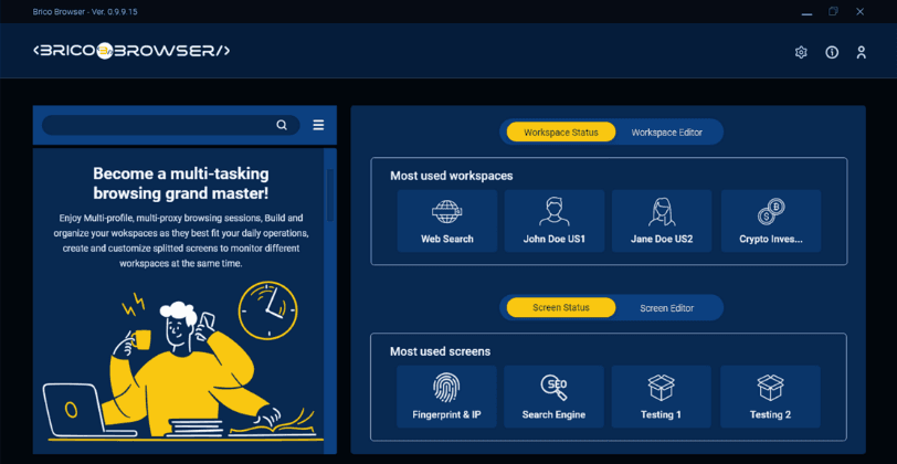
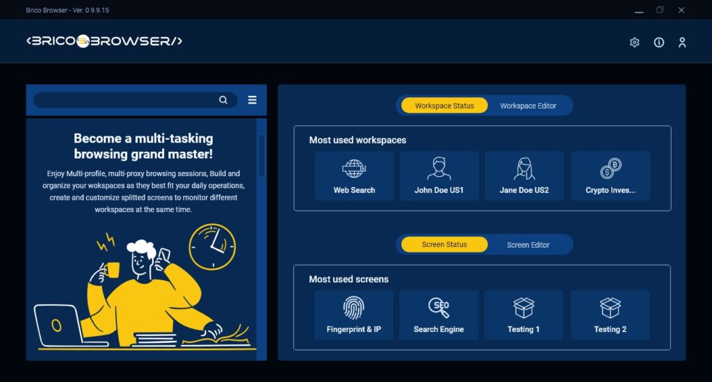
BricoBrowser merges browsing functionality with workspace optimization, providing effective organization and streamlined workflows for enhanced productivity. It is a versatile tool designed to improve workspaces, allowing users to browse seamlessly while maximizing efficiency.
The client wanted an app with the said functionality with Great UI/UX and also wanted it in both light and dark theme. The main challenge I had were with creating a cohesive user experience while accommodating both light and dark themes. Balancing the visual elements and ensuring readability, accessibility, and intuitiveness across both themes were very crucial. The main problem lied in seamlessly integrating the design elements to provide a consistent and pleasant user experience, regardless of the chosen theme.
Audience Research & Competitor Analysis
According to brief research, I found out that the target audience for similar apps consists of professionals, students, and individuals who heavily rely on web browsing. They expect efficient multitasking, customizable interfaces, seamless integration with productivity tools, cross-platform compatibility, and the ability to switch between light and dark themes turned out to be a good idea for enhanced visual comfort and personalization.
Design
In designing the UI of the BricoBrowser app, I prioritized efficient workspace organization and streamlined workflows. I took careful consideration of readability, accessibility, and intuitiveness in both light and dark themes. The design featured customizable interfaces and seamless integration with productivity tools. I made a number of iterative prototyping before coming up with this one to ensure the final UI design meets the target audience’s expectations and enhances their browsing experience.
Light Theme
Dark Theme
Conclusion
The design project was successfully completed, meeting the client’s requirements. After being organized, it was sent to the client for review.